
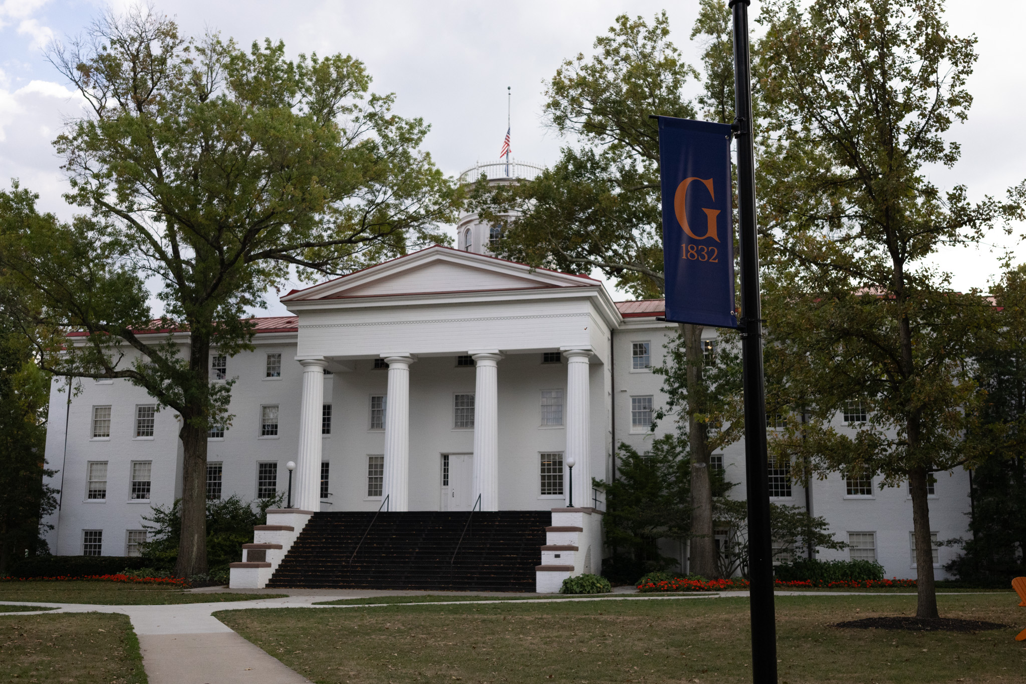
Scenes around campus featuring the new Gettysburg College visual identity. (Photos Grace Jurchak/The Gettysburgian)
By Omer Shamil, Opinions Editor
Just like many of you, I got to know the new logo through the school’s social media post, where it looked quite right but not so right at the same time. I think the biggest question that was making it more uncomfortable was why? As the semester started, I heard the logo in many different circles in many different environments. While many never wanted to say anything on the record, the general sentiment can be defined as follows:
Con·fu·sion: a lack of understanding; uncertainty.
The murmurs in CUB and Servo were strong. Not angry—just puzzled. The kind of talk that lives halfway between complaint and curiosity. “Why now?” someone would ask over beef mushroom tips at Servo, and there would be no answer. I kept hearing versions of that all through September. This confusion wasn’t hatred; it was misplaced emotion. We were looking for a reason to understand a decision that had already been made. So I started looking for the “why.” I reached out, read the email, asked around, and found that the answer wasn’t a single sentence but a sequence. The first piece came quickly: the redesign coincides with Gettysburg’s bicentennial and a new curriculum and strategic direction, its simple consequential education. It’s not just a logo; it’s part of a larger moment of reflection. Who we’ve been for two centuries and who we’re trying to become next.
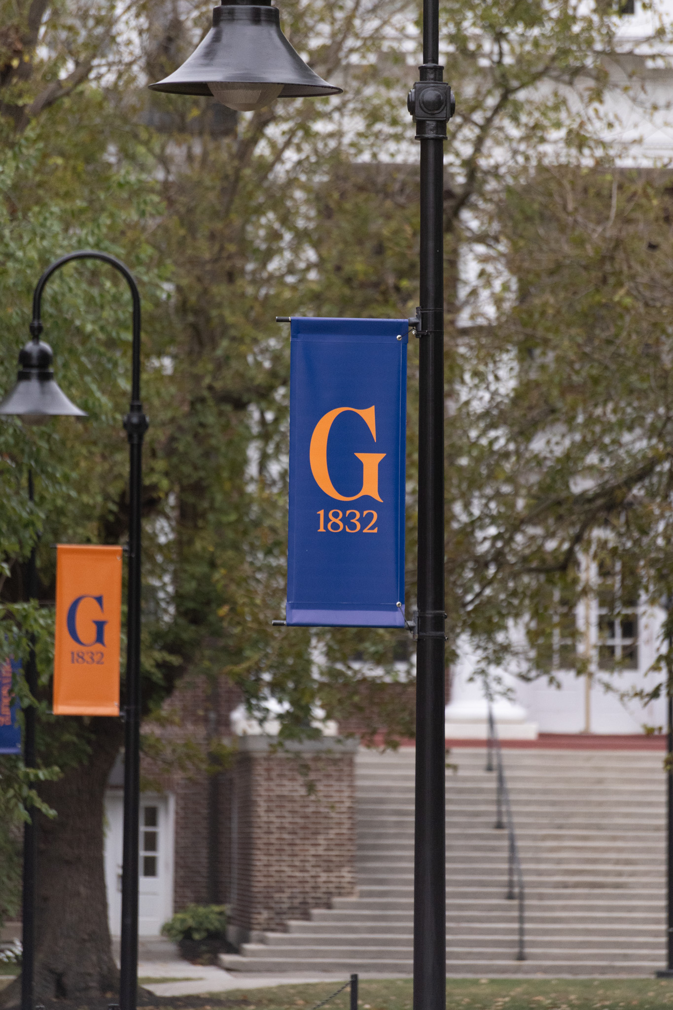
Scenes around campus featuring the new Gettysburg College visual identity. (Photos Grace Jurchak/The Gettysburgian)
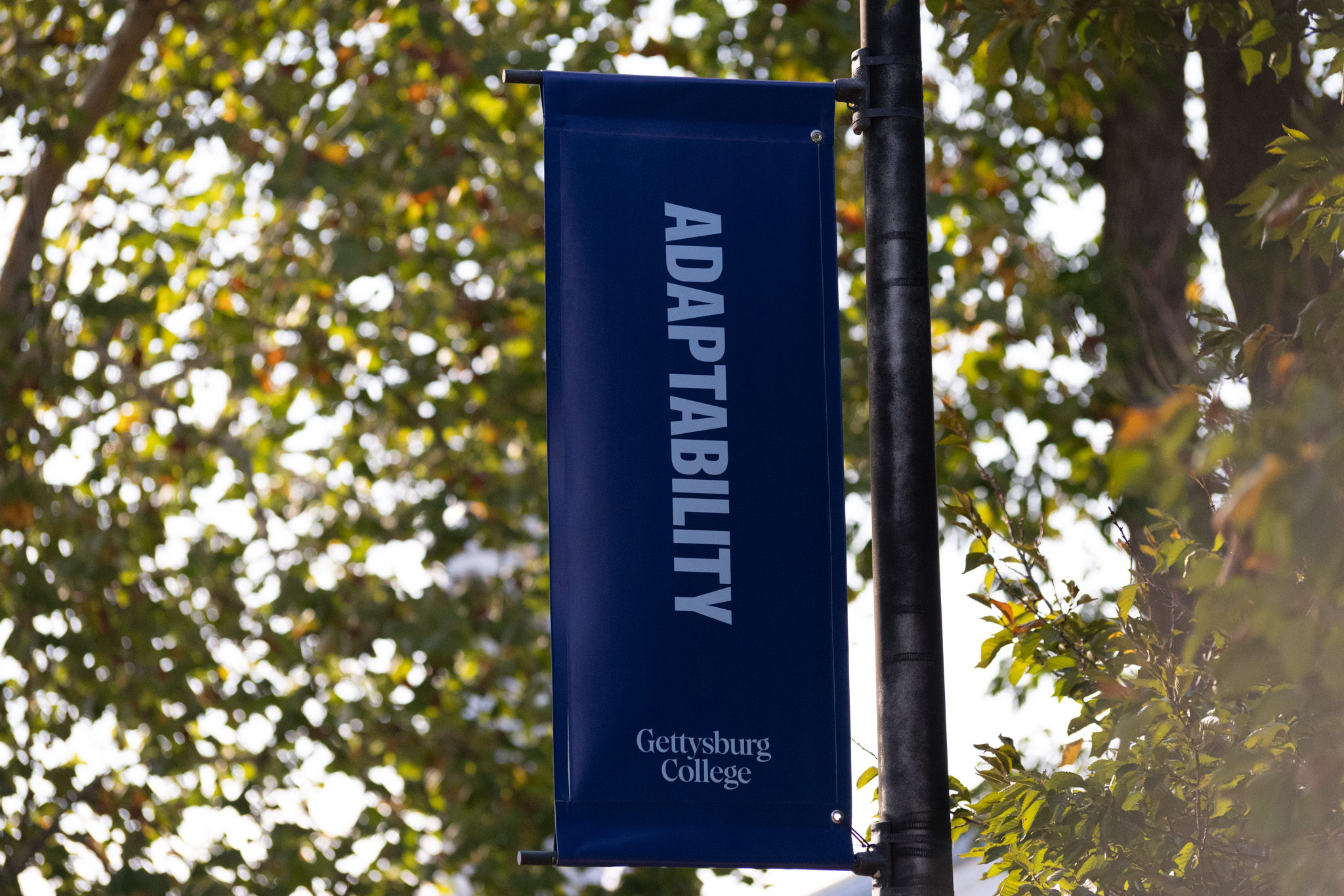
But that’s the official line, right? I wanted to know what that actually means. When I spoke with members of the Communications and Marketing team, they told me, “It wasn’t about replacing our past, it was about making it legible for our future.” Their words carried that triad the College has now made its refrain: distinct, timeless, enduring.
When I finally sat down with the design notes, I realized how easy it is to mistake change for departure. The redesign, I learned, isn’t a break from who we are but an evolution of how we show it. It’s the same name, the same cupola, the same spirit—just drawn with a steadier hand for a new age. The difference is subtle but intentional: a realignment, not a rebrand.
The first thing that caught my eye was the wordmark. The letters are heavier now, built on a serif font that carries the weight of tradition without feeling dated. “College” has grown slightly in size—a small design decision that suddenly makes it legible on a phone screen, a street banner, or a water bottle. Then there’s the Gettysburg G, the centerpiece of all this conversation. The old Split G had muscle and pride, but it was never uniquely ours; too many other schools shared its silhouette. The new G feels different. There’s a curve in its spine, a touch of calligraphic movement that makes it look drawn rather than printed.
Professor Felicia Else, who served on the Visual Identity Campus Working Group, told me the letter reminded her of Renaissance brushwork—“age-old calligraphy streamlined for contemporary use,” she said. “It’s a perfect symbol of what the College does: drawing from the lessons of our past to prepare for a new, current age.” The more I looked, the more I saw what she meant.
Even the seal carries that dialogue between old and new. It still holds the Cupola, the flag, and the delicate beading of earlier versions, but now a laurel wreath circles the design—a quiet nod to the pattern carved into Penn Hall’s rotunda floor, the same floor students cross when they arrive and when they graduate. Amy Lucadamo, the College Archivist, called that detail “a bridge between generations,” and I think that’s true. The more I looked, the more I realized how much of our story still lives inside the new mark.
By the time I started tracing how this all came together, the redesign wasn’t born in a closed meeting room; it grew from yearlong conversations with more than 200 people across 30 focus groups.. Students, professors, alumni, and staff all weighed in, bringing every possible version of “what Gettysburg feels like” to the table. I didn’t attend the early concept meetings, but I heard about them; the differing openings, the strong opinions, the quiet nods. Some sessions started with skepticism and ended with curiosity. One participant told me, “We knew how important this was going to be, and that made us listen harder.” That line stuck with me. It wasn’t just about fonts and flags; it was about ownership, who gets to decide what represents us.
As I read through the summaries and spoke with those who were there, I kept thinking how this mirrored the College itself. Every suggestion, every disagreement, every revision — it all reflected the same diversity of thought we pride ourselves on in classrooms and clubs. In a way, the design process became its own Gettysburg seminar: discussion-based, sometimes messy, but ultimately rooted in care. And maybe that’s why the result works. It wasn’t handed down. It was shaped, challenged, and collectively signed off by a community that, for once, got to see its identity debated out loud.
If there’s one letter that can stir up a dining-hall debate, it’s G. The Split G: bold, blocky, and forever stitched across sweatshirts—still feels like a badge of belonging. hoodies, lacrosse gear, even mugs that have outlasted move-ins. It’s a logo that’s lived more lives than most of us. So when a new G arrived, it was only natural that people compared it to the one they grew up with here.
Around campus, the conversations sound almost rehearsed by now. Some admire the change: “It looks cleaner,” a friend told me.. And some still can’t decide if they like it or not. Change, I’ve realized, is always hardest when it touches identity, especially the small, familiar symbols that quietly mark our time here. Michaela Carroll ’25, one of the student representatives on the Visual Identity Working Group, told me she saw it as “giving the Athletic G back to athletics while introducing a G that better reflects the full range of who we are as students.” I think she’s right. Most of us aren’t rejecting the new G; we’re just learning where to place it in our own stories.
Scenes around campus featuring the new Gettysburg College visual identity. (Photos Grace Jurchak/The Gettysburgian)
If there’s one thing this whole process has taught me, it’s patience. Understanding takes time, just like change itself. The rollout is happening gradually, funded through restricted, Board-approved marketing investments, with most updates folded into existing budgets. Old merchandise is being discounted, new banners are appearing, and both versions of the G will likely coexist for a while. That feels right, honestly. Change doesn’t need to erase what came before it. When I walk across campus now, I still see the Split G on hoodies and laptop stickers, and the new Gettysburg G on banners fluttering over the Quad. Both feel like us—just different moments in the same story. If our logo is the face of who we are, maybe this is less about changing the face and more about growing into it. Time will tell, but for now, I’ve learned that understanding why something changes is often the first step to seeing yourself in it.
This article originally appeared on pages 6-7 of the October 2025 edition of The Gettysburgian’s magazine.