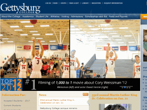
Redesign of College webpage aims to improve mobile site
By Christopher Dellana, Contributing Writer
In a 1987 article, New York University’s Frances J. Milliken cites the variable invoked by organizational theorists known as “environmental uncertainty.” This concept, though debated, establishes a psychological reason that validates human resistance to change. Whether we fear the uncertainty of change or simply resist alterations to the status quo, human reluctance to change is a well-documented component of our psyche.
For those familiar with the social media site of our generation, Facebook, the change from the old format to the Timeline spawned all types of resistance. The tech-savvy geniuses working for Facebook knew all too well that there would be reluctance in forcing the change upon the site’s more than 1.05 billion monthly users so they instituted a time table to soften the shock.
About a week ago, we all moved on to a new age in Gettysburg: the era of the new College website. The anticipated learning curve excited general discontent among students and some faculty even before the new homepage took effect. Last Monday, (Feb. 10) as the Gettysburg servers seemed to go M.I.A. for several hours, the new design was making its debut as the Office of Communications and Marketing took down the old and put up the new. Before midnight, the Gettysburg homepage was updated for the first time since the last full-scale change in 2006.
The directors of the Communications and Marketing Department first announced the changes to the Student Senate on Feb. 4 and posted announcements in the campus digests outlining the reasons behind the switch.
While the principal changes appear to be aesthetic and perhaps arbitrary, there is (quite literally) more than meets the eye to the science behind the project.
Among many institutions of higher learning, the trend toward websites utilizing the Responsive Web Design (RWD) model is growing according to the list compiled by Erik Runyon, University of Notre Dame’s full-time University communications web-developer who, according to his biography, spends time with his “three kids and two vomit-happy cats” when he is not analyzing responsive web design.
This pattern at other schools, however, has done little to mediate the concerns of students. “It just doesn’t look professional,” a Senior Political Science major said, pointing out that “there’s no border and it makes you feel like you have to scroll down because it feels like it doesn’t fit the screen.” Similar concerns have been voiced over the true necessity of the change—stated differently: why fix something that is not broken?
Paul Fairbanks, Director of Web Communications at the Office of Communications and Marketing at Gettysburg College, said over correspondence that the objective of the change was to “offer a mobile experience that went beyond the current mobile site, and I think we have done this.” The previous model of the website, he said, did not respond appropriately to the increasing demands of a technologically-dominated age. At the core of the RWD model is flexibility and the versatility offered by the new site can handle any data query. Mr. Fairbanks further provided several resources evincing the rising-success of RWD platforms. In Pete Cashmore’s article Why 2013 is the Year of Responsive Web Design, he highlighted that 2012 was the first year since 2001 in which computer sales saw a decrease in sales from the preceding year. What does this mean? Sales in the other sectors of technology are increasing.
The general consensus among professionals is that Responsive Web Design is the way to the future and will more adequately serve the needs of today’s users. So, just like the introduction of Facebook’s Timeline, this new website must pass its trials of initiation. Ultimately, Paul Fairbanks spoke on behalf of the Communications and Marketing department as well as those of various campus groups when he contended that “the reaction to the new design has been very positive and we [are] always open to constructive feedback.”

